
Recently, a long-awaited feature was added to Power BI: Small Multiples. If you’re not a reporting specialist, chances are a big question mark popped up above your head when you read that. Small Multiples? Long-awaited feature? What are we talking about?
Reporting tools give you the possibility to present your data in various ways. One of the goals people want to achieve with reports and dashboards is the ability to compare measures across multiple dimensions. There are different ways of doing this, which we can show you with some examples. Imagine we want to see our sales by Year, Month and Country. Let’s check out our options. You can download the Power BI file here.
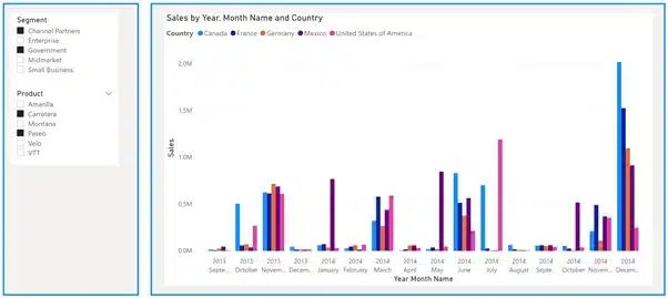
This can be a good solution, but you are limited in your formatting options. For example, it looks strange when you only have two elements on the X-axis. This type of presentation also makes it difficult to compare numbers.
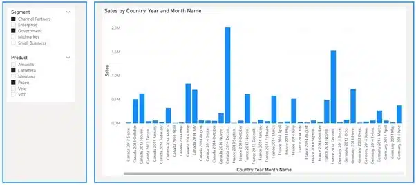
This can be a good solution, but it can become difficult to understand and compare values when the hierarchy creates too many elements.
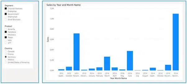
This looks pretty clean and gives a lot of insights, but you have to change the slicer to see results for another country. Values for different countries are never shown on one page, making them difficult to compare.
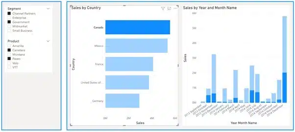
This is similar to the slicer option, but has the advantage that some comparison is possible because we have the total sales per country. At a more detailed level, comparisons become less clear, but we still have some indication.
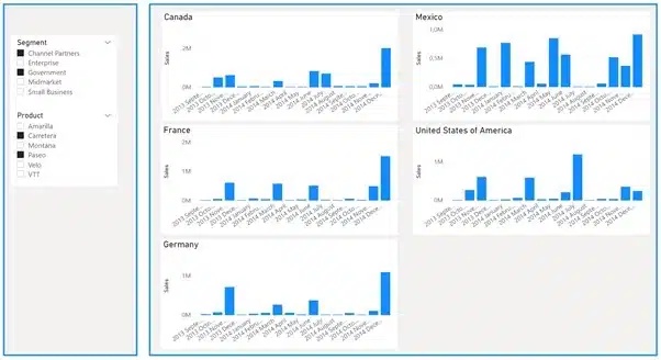
Of all the previous attempts, this is the best option so far for comparing countries. Unfortunately, there are also some disadvantages to this approach. You need more reporting space because you have to create a visual per country – my frame from the previous options was not large enough. This means you have a hard limit of six to eight countries when you keep default page sizes in Power BI. Another consequence is that the countries shown are fixed. Sales in a new country will not appear here.
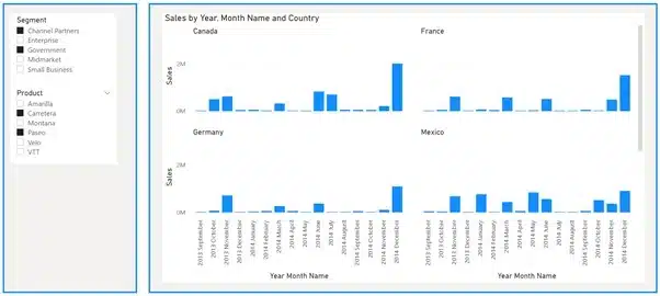
This looks similar to our previous option, which is basically because option 4 is already a small multiples solution, although not a dynamic one. So, what do we gain from using Small Multiples? A new chart for every country that we have in our reporting context. A big advantage is that this is one visual, with multiple charts instead of multiple visuals.
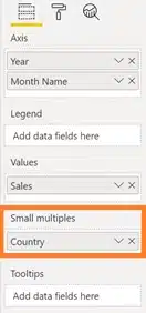
Don’t do what I did when I heard we could use small multiples in Power BI, which was to immediately start looking for a new visual. To my disappointment, I could not find any. Then a little voice in my head said ‘RTFM’. Reading the release blog from Power BI made everything clear: there is no new visual because Small Multiples is integrated in several other visuals such as bar charts, column charts, line charts and area charts.
You just have to drag the desired column into the field under the header ‘Small Multiples’. It’s as simple as that. Pretty smart, I reckon!

Crafted by ![]()
Crafted by ![]()


