


 In business intelligence we extract data from everywhere. Besides the technical structures that define how the data is stored, we also need to understand the business processes behind that structure. It’s all in the name, right?
If it was as easy as simply extracting the data from the source and loading it directly into the data warehouse, BI analysts/developers would become redundant. In many cases the incoming data is transformed, which entails extra business rules or logic being applied to obtain a final, correct, expanded data set that makes sense to the business user and offers clear insights.
If a business rule isn’t translated properly into a technical transformation, this early error – which can be a small detail – made between analysis and development will cascade further and can have disastrous results. Defining this translation requires communicating with the people involved at the technical and the business level. This can mean meeting up, calling, or in most cases emailing the relevant people. In my personal experience, I’ve noticed that a visualization of a question/problem tends to give people a better understanding of the issue and involves them more effectively. A diagram is concise, more appealing and less prone to ambiguity, which goes hand in hand with the KISS principle (Keep It Short and Simple). Remember, nobody is waiting for the 100th mail of the day with pages of text.
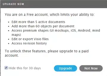 You can create clear diagrams with Lucidchart. The application is a direct competitor of Microsoft’s Visio, which also offers extensive capabilities, but Lucidchart has the advantage of being cloud-based, so you don’t have to install anything. Since the customer often provides a workstation, it means you have access to a cloud-based working environment and a document repository for free. These benefits are why I choose Lucidchart over Visio. Being free also means having limited capabilities, but you still have a diverse range of options.
The user interface is appealing, responsive and intuitive, so you can get started quickly. You can import and export to Visio files and although this isn’t a free feature, it’s nice to know that the tool offers this kind of extensibility.
The main benefits of Lucidchart for me as an individual user:
Next I will explain two personal kinds of visualizations that recur from time to time.
Business user vs the BI developer:
 Business needs often involve time as a transformation parameter. In my eyes this can quickly become a maze, especially if the business user is defining cases on the spot. Figure 2 shows the results of a first meeting with the business user. I have visualized 3 different cases based on a timeline (grey line), events (yellow rectangles) and contracts (green rectangles). All kinds of events can happen within a specific time period of a contract. The visual representation acts as a starting point for helping the business to think about new cases more easily: for instance, what if I drag a yellow rectangle behind a green rectangle? Moreover, this way we have common concepts based on colour: a timeline, an event and a contract. So we are always talking about the same things when communicating with each other. While this may seem self-evident, my experience teaches me that this is definitely not always the case.
Technical user vs the BI developer:
 After the business requirements have been defined, a lot of times you will be searching for the correct data. This means going to the technical person who has knowledge of the data source: an application developer, functional analyst, etc. Sometimes this is a real hassle because of the normalization of OLTP systems, which xxx. You have your business definition that you can explain to the technical person and normally they should be able to point you in the right direction. But this isn’t enough. Remember, the devil is in the detail.
Occasionally I have been presented with an ERD (Entity Relationship Diagram), which made all the difference. So I have tried to create my own ERDs for source entities/tables, especially for longer assignments. Sometimes it may seem like overkill to make an ERD for 3 entities, but I have learned that with new business requirements new tables will have to be migrated with or without additional transformations. After a year you may end up extracting data from 40 entities and then a good ERD will prove its worth as a blueprint for offering quick insights.
Do we have to visualize everything? Of course not, but when it is the most efficient way to explain complex problems, define business cases, dissect database structures and so on, don’t be afraid to try it.

Crafted by ![]()
Crafted by ![]()


