


We live in a world where an enormous amount of data is available. But having access to the data is not the same as having insight. If we combine this data access with the right tools and a little bit of effort, you might be able to transform your data into information in no time.
I have had this particular example at a client where the results of a nightly ETL load is sent on a daily basis. It merely contains the status (success and error) and the start/end times (the status is also part of the email subject). This is for both their test and production environment. All these emails are dropped into an Exchange folder of my choice. This is an example email:
Dear,
Here is the result of the job :
30/11/2016 22:12:47 : Script DataMart_LoadData has started
30/11/2016 22:12:47 : Executing SSIS Package Datamart_SYN_Master.dtsx With Parameter :
01/12/2016 00:03:47 : SSIS Package Datamart_SYN_Master.dtsx Successfully executed
01/12/2016 00:03:47 : Script DataMart_LoadData has ended
Regards,
AutoSys
The log can be consulted here :
\\SomeFolder\LeftOutDetailsForSecurityReasons.log
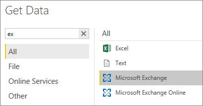
The emails are being sent for more than a year now, but by looking at the emails one by one, it is very difficult to see a trend or a pattern. In the ideal world, start and end dates of an ETL should be coming from the log tables from SSIS, not from a collection of emails. But sometimes the ideal world is not at reach. Luckily with Power BI, we have a tool set that can connect to many sources and even integrate them in a model. One of the connectors that comes with Power BI is the Microsoft Exchange connector.
After choosing the Microsoft Exchange connector, we’re prompted to enter a mailbox. In the next step, we will choose which folder to load: Mail in our case.
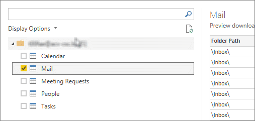
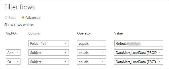
We’re interested in filtering values from a subfolder of the \Inbox\ and further on, we only want to include emails with a certain topic. So, we filter the emails on their Folder Path and Subject to include only the emails we’re interested in.
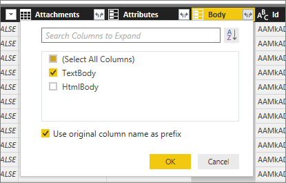
Because we need to extract data from the email body, we go to the Body column and choose to keep the TextBody.
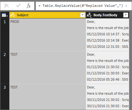
We’re having a lot of redundant columns and therefore we only keep the columns Subject and Body.TextBody.

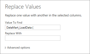
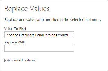
Next, we’ll clean up some of the prefix and suffix strings, so we only have the Environment (PROD and TEST) in our Subject column (we actually replace it with an empty string).
Now it looks like this:
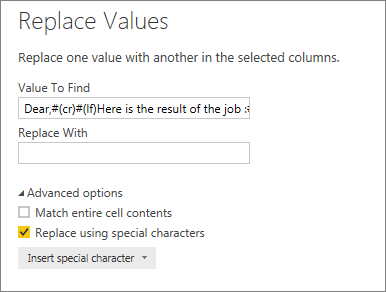
We then rename the column Subject to Environment. The tricky part is to retrieve the start and end times of the ETL, which are part of the message body. So, first, we clean up the introduction text and the signature of the emails, as they’re always the same. Even though they contain line breaks, we can do this by checking the Replace using special characters and insert the necessary line breaks (carriage return + line feed).
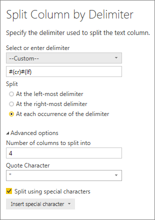
What’s left is a column Body.TextBody with four lines in each cell: four dates followed by some text. We will now split each cell over as many columns, again by using Split using special characters.
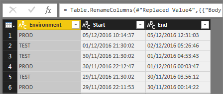
We remove the two unwanted columns (the two in the middle) and remove the suffix from both columns.
Finally rename the columns with something more appropriate: Start and End.
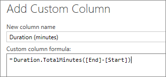
The dates are still in the Text data type, so we change the data type to Date/Time. In our case this works just fine, but if it wouldn’t have worked, for example if the month and the day were switched, we would still be able to extract the date by using a custom column. We also add a custom column to calculate the time difference in minutes between Start and End date. To accomplish this, we use the M function Duration.TotalMinutes.
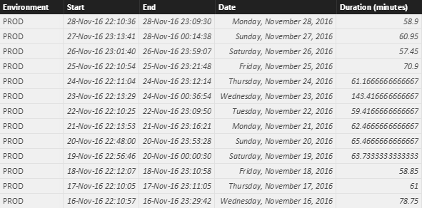
At the end, we duplicate the Start column to get the start date and change the data type from Date/Time to Date (only the start date is important, not the start time). Also, the data type for the duration is set to Decimal Number. Now we’re done with cleaning up, click Close & Apply. We end up with a table that looks like a regular data table, not like a folder in your inbox.
We could have left out the Start and End columns in the output, but I figured they could be used some time as a back reference.We can start creating some reports now: we create a simple line chart with a trend line, that tells us how the load times behave over a longer period of time (in this case it was filtered from April 2016 until October 2016). When showing both the test and production environment, it all seems pretty stable.
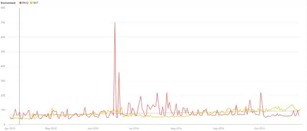
This seems true for the load of the production environment.

But when we zoom in little (starting in july), we see that the production ETL is going faster over time.
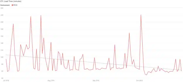
The stability we did see at first was partly caused by the some outliners, but the visual effect was also masked by the same outliners. To prevent this, you can overrule the Start/End values on the Y-Axis. On the test environment we see the opposite trend.
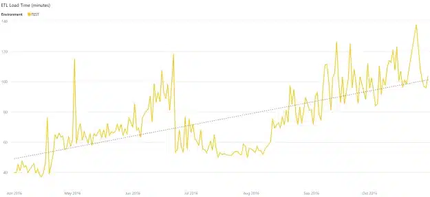
And this is true: production has received some minor hardware-upgrades over the last few months, while this was not the case for our test environment. Also, the test environment is used for more purposes than just ETL, while the production environment is dedicated for ETL.
By gathering emails, and having the right toolset, you can make your emails speak more than just words. And how cool is it if you can go to your manager and show him/her a visual with insights and then saying that you extracted this from your emails!

Crafted by ![]()
Crafted by ![]()


