


Recently I worked on a Power BI project for a client. They had a SharePoint site where they regularly published articles and wanted to pour view data into a report to track which pieces of content were performing well. One of their requests – sorting the matrices by different values – for the Power BI report turned out to be as tricky to implement as it seemed straightforward when I first heard it. A rare occurrence! Let’s explore the solution to this conundrum.
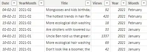
The whole report focused on articles that were published in their SharePoint environment. One of the key metrics was the number of views these pieces of content get, with more being better. To explain the solution in this blog, I’ve created some sample tables called ‘Articles’ that have some basic fields:
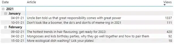
To start analyzing why articles score well, the client needed to find which articles scored well first. The logical request was as follows: please give us a table or matrix that shows the top three most-viewed articles per month, per year. The months should be sorted in descending order and the articles within those months should be sorted from most number of views to least. A more visual example:
2021 Views
February
Title 1 x3
Title 2 x2
Title 3 x1
January
Title 1 y3
Title 2 y2
Title 3 y1
2020
December
Title 1 z3
Title 2 z2
Title 3 z1
“Of course!”, I thought, “No biggie!”. A textbook example of the Dunning-Kruger effect. My Power BI skills aren’t top notch. My focus the past few years has been on Azure and the report building I’ve done has been focused on Sequel Server Reporting Services (SSRS), not Power BI. However, I do know how I could build this in SSRS and how I’ve only rarely encountered visuals in SSRS, that I couldn’t quickly replicate in Power BI. Mind set to the task, I quickly got started and before I knew it ran into the first issues.
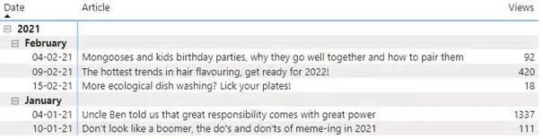
The main one I found, is that Power BI does not allow to sort by both the rows (date, month or year) as well as another value, in this case number of views. I could either sort by number of views, which meant the dates were not in the order requested (newest, i.e., February, first):
Alternatively, I could sort by date, but this made it so that the articles weren’t ordered by number of views anymore:
After scouring the internet, I found that the only thing that could maybe help was using a RANKX()-function. Simply put, you give the function a table as context and pick – in our case – a column to sort by. If you do so, you end up with a ranking number. What I couldn’t find, however, was any blog or other page that detailed how to effectively combine this function with a matrix. After a bunch of tests, I found a solution that is a bit raggedy, but I’m happy to report it works well.
For starters, I needed the ranking for the articles. This is an obvious starting point for a ranking solution and will also be important later for filtering. So, I created this calculated column in my table:
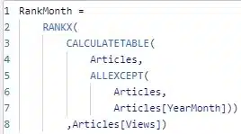
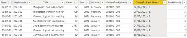
This code creates a table with the articles grouped by YearMonth and then assigns them a rank based on the number of views. The article with highest number of views in its month gets rank 1, the second highest gets rank 2, etc. This resulted in the column on the far right:

This new column was immediately useful, as it functions well as a filter in my visual:
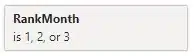
By limiting it to ranks 1, 2 or 3, I will only see the top 3 most-viewed articles in my visual. Perfect!
However, after playing around some more with this new column in the matrix, I concluded that it didn’t sufficiently allow me to sort in the requested way. I looked further and the idea I ended up going for, was to create a support column that I would hide in plain sight. I put the entire logic for the sorting in a single field that I named – aptly, if I’m writing my own reviews – HiddenRankMonth:
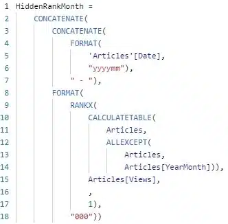
At the heart of this formula, the same calculated table is created with the articles grouped by YearMonth. Again a rank is assigned to the articles with the RANKX()-function, using the Views as the basis for the ranking. An important difference though, is that the last argument for the RANKX()-function is this time specified as 1. You could also put “ASC”, for ascending. This means that if we have 4 articles in a given month, the article with the highest number of views will get rank 4, the article with the second highest gets rank 3, the lowest is rank 1.
This might seem counter-intuitive at first, but there is a method to the madness. We need to order year and month from most recent to oldest in our visual. Since I am attempting to put all the sorting logic in one field, this forces my hand to also sort the rank in descending order. And thus, I need the article with highest number of views to also have the highest rank number. It makes more sense visually, so please do look below:
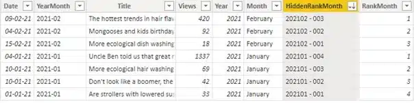
By sorting on the new HiddenRankMonth field, our data is already in the order we need it. First sorted by year (all 2021, so in this example of no consequence), month (February at the top, January lower) and then views within each month (highest first). All that remains doing is implementing in our matrix:
Adding this column, we can sort on it and now our matrix is also sorted as per the client’s request. We now have an ugly column in our visual though, not ideal. To fix this, I changed some formatting settings for the matrix visual. I turned off word wrapping for both values and column headers. Then I simply made the column as slim as the visual allows, which looks like this:

There is a tiny sliver of the extra column still visible, but only to the sharpest of eyes. I would dare say this will be unobtrusive to most. With the sorting sorted, I was chuffed with myself…
…until I noticed that for some months it wasn’t displaying a top 3, but rather a top 2. Worse even, sometimes these top 2’s were seemingly unsorted by the number of views. This is more evident in the sample data, I’m sure some readers will have noticed in the above screenshots.
This puzzled me at first. Looking into it more, I found that when:
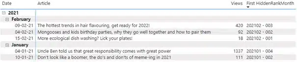
In my sample data, I created two articles with 10/01/2021 as the date and that held rank 2 and 3 respectively in that month. In the matrix it only shows the ‘Boomer’ article, since it has the higher number of views of the two (69 vs. 42). Moreover, it displays the number of views as 111, the sum of these numbers.
To fix this, I must make the row values in my matrix unique. The most visually pleasing way I found to do this, is with the following calculated column:
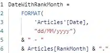
This formula simply concatenates the date and rank for an article and formats them a little. The resulting new column is unique (enough):
There is a fringe case where 2 or more articles in the top 3 get published on the same date and have the exact same number of views that would not be unique. This was more than improbable enough in the context of our client’s data, that it was not a concern, and I didn’t overcomplicate it needlessly. Be wary though for the context of your use case!
Anyway, I digress. Back to our solution now, the new column implemented in the matrix, instead of just the date, looks as such:
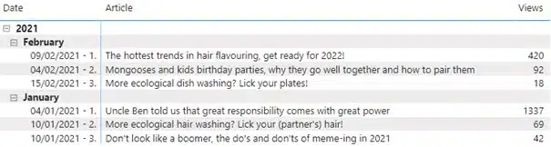
Finally, the result we were looking for. Way harder than I anticipated when I set out. I was a bit naive there. Regardless, with some internet sleuthing and some good old trial and error, we had another happy client.

Crafted by ![]()
Crafted by ![]()


