


The possibilities are infinite when it comes to creating custom visuals in Power BI. As long as you are creative and have knowledge about the right programming language, you can let your imagination run free. I’ll talk about languages – specifically about R – in more detail later. One interesting application of those endless possibilities is making maps with Microsoft’s visualization tool. Let’s have a look at how to go about that.
For this tutorial, I used R as my coding language. The reasons I chose it are:
It’s also possible to create custom visuals in JavaScript/TypeScript which is the default language for designing made-to-measure visualizations in Power BI. Personally, I find this more difficult to work with. It requires more knowledge to understand the language and there’s less detailed documentation about what the functions do specifically.
As far as I know, there are ready-to-go visuals in the AppSource for adding maps with shapes and the built-in tooltip functionality of Power BI. Nevertheless, the purpose of this blog is to give an example on how to start creating your own custom maps with R and Power BI. Moreover, it can set readers on their way to expand on their visualization possibilities and create custom imagery that doesn’t yet exist in the AppSource.

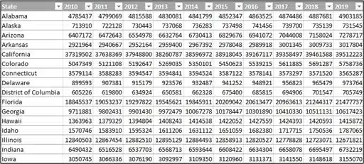
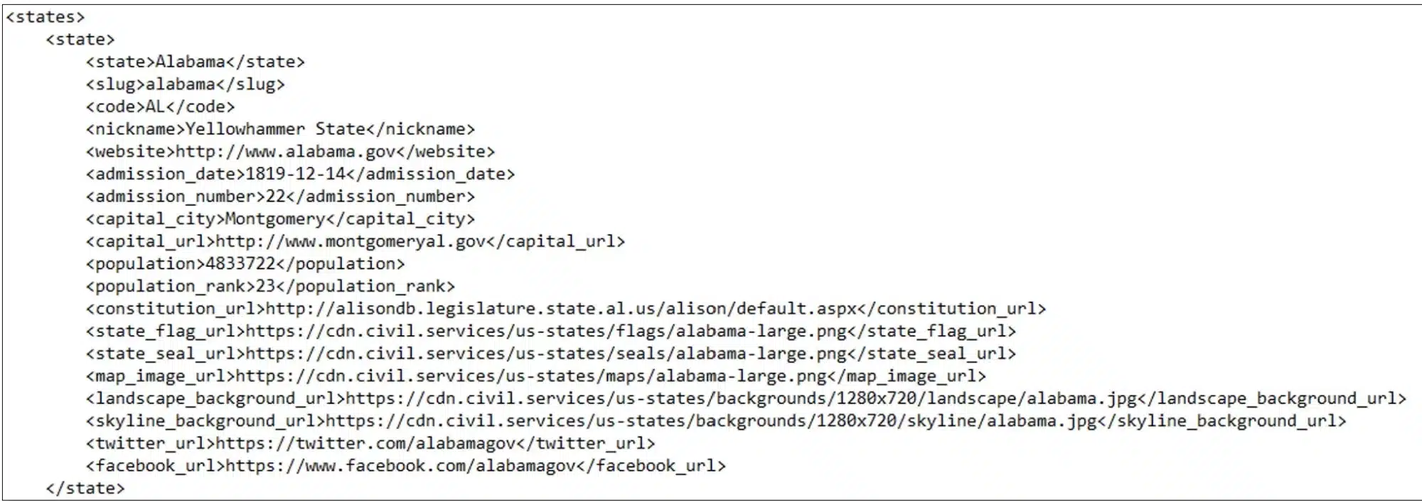
The custom map which I created with R represents all the states and the evolution of the population over the years. I used three different datasource to get the desired data in Power BI:
I won’t go into detail about the transformations I did in Power Query M, but I molded the thus far imported data to the following:
Before we get to the most interesting part, a brief explanation of the data model I used.
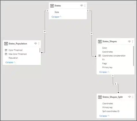
There are only a few fields that are sent to the R custom visual to process:
The following rows are sent to be processed for the R custom visual:
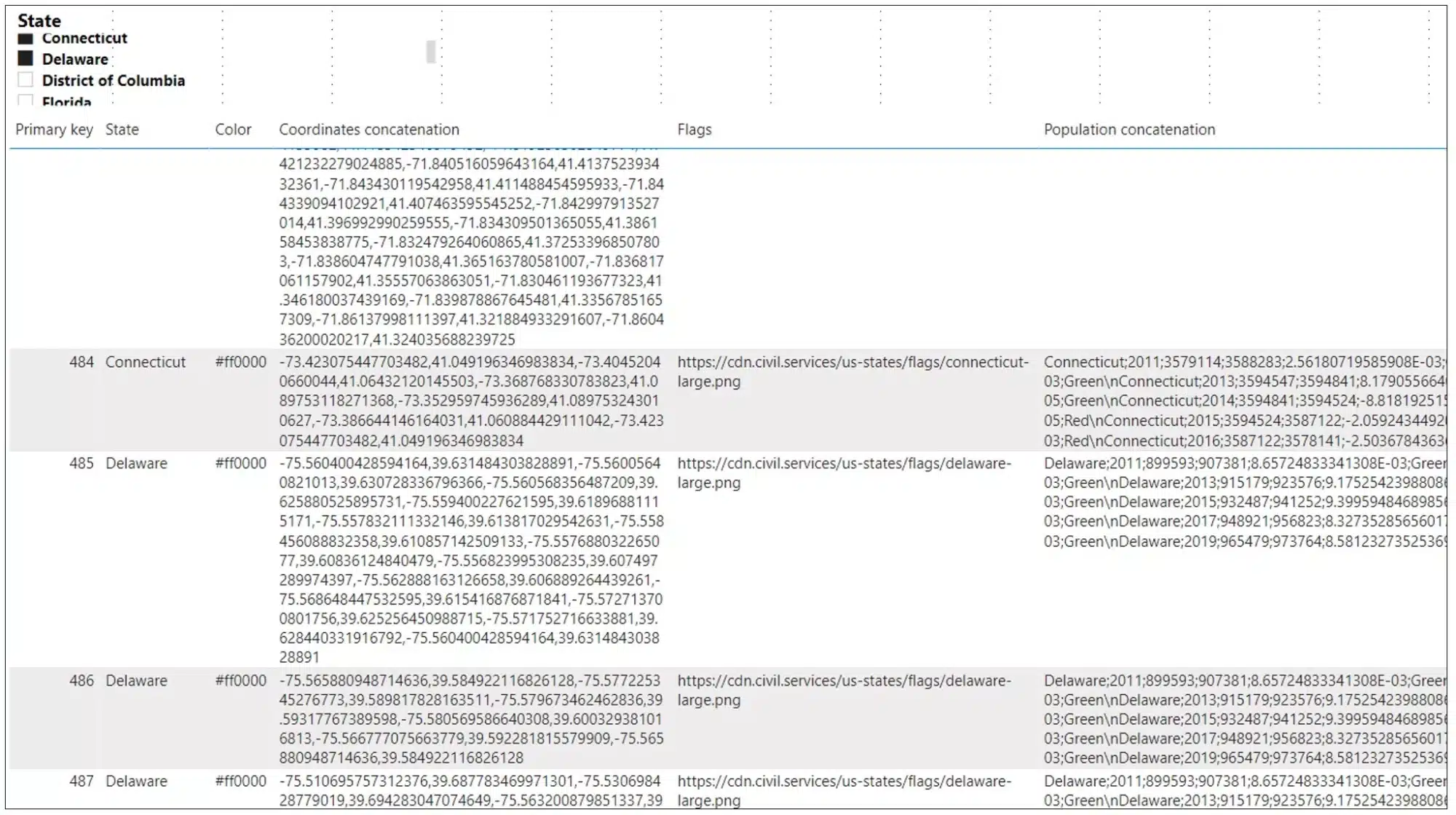
The ‘Population concatenation’ field is a measure which concatenates all the desired data for the chart in the tooltip. The reason I created a measure for this is because otherwise Power BI can’t determine the relationship between the two unrelated tables ‘States_Population’ and ‘States_Shapes’.
Population concatenation =

CALCULATE(

    CONCATENATEX(

        FILTER( States_Population, States_Population[Population LY] <> BLANK() ),

        States_Population[State] & ";" & States_Population[Year] & ";" & States_Population[Population LY] & ";"

            & CALCULATE( SUM( States_Population[Population] ) ) & ";" & States_Population[Population YOY] & ";" & States_Population[Color Threshold] & "\n"

    ),

    CROSSFILTER ( States[State], States_Shapes[State], BOTH )

)
It is not always necessary to do it this way, because it depends on how your data and data model looks like.
To let your local Power BI desktop use R, take a look at this article to know what to install first. To create my custom map in R, I’m using two environments.
First, I’m going to create a new empty custom visual which contains the folders and files that are making sure the custom visual will render correctly in Power BI. The most important file for this is the ‘script.r’ file where all the code will reside in.


The first line of code is written by default because the R code in general uses some specific functions used in the folder file ‘./r_files/flatten_HTML.r’. It is specifically used to install the required packages and to save the output of the script into an HTML widget for Power BI to use it.
The second line of code is a global option that I use to prevent R from converting the strings into factor variables. Based on my experience, I’ve had some issues in the past rendering my custom visual without this option because the strings in my data frame are converted to factor variables by default. There have been a lot of debates regarding this option. To learn more about this, I would recommend this article.
source('./r_files/flatten_HTML.r')
options(stringsAsFactors = FALSE)
The next important piece of code is the declaration of the required packages.
############### Library declarations ###############
libraryRequireInstall("leaflet");
libraryRequireInstall("sf");
libraryRequireInstall("htmlwidgets");
libraryRequireInstall("dplyr");
libraryRequireInstall("stringr");
libraryRequireInstall("ggplot2");
libraryRequireInstall("data.table");
libraryRequireInstall("cowplot");
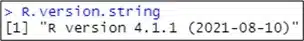
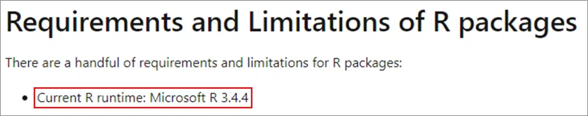
It’s good to know that the R version and the version of the packages can differ between your local R Studio (Power BI) and R in the Power BI service. Locally, the version of R in my case is 4.1.1 and in Power BI service it’s 3.4.4. To know more about the packages and their versions that are installed in Power BI service you can find more information here.
I’ve had some problems where my custom visual worked PERFECTLY locally in Power BI desktop, but I had an error in Power BI service.
The following piece of code initiates an empty map and adds specific tiles to it to get the desired rendering of how the states are shown. By this I mean if you want to see the roads, or the railways or the relief in detail on the map.
############### Create an empty leaflet map ###############
LeafletMap <- leaflet()
LeafletMap <- addProviderTiles(LeafletMap, providers$CartoDB)
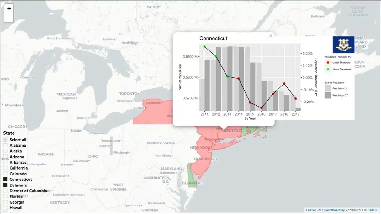
I’m creating the tooltips to show a chart with the population over the years that will be saved as an SVG file and stored into a temporary folder. When running the script locally, I can find this folder back on my desktop, but I always wondered where this directory is located when running the script in Power BI service.
############### Create a temporary folder to store the SVG files for the tooltips ###############
TemporaryFolder <- tempfile()
dir.create(TemporaryFolder)
The following piece of code will iterate over each state and execute the two functions that I’ll discuss in the following sections.
While I discussed the data model, I already mentioned that each state can contain multiple shapes. This means that the function ‘CreatePolygonFunction’ executes for each shape based on the ‘primary key’ column. However, the function ‘CreatePlotFunction’ executes only once, for each state and not for each shape. The last function ‘addPolygons’ that is part of the leaflet package adds all the shapes with their corresponding tooltip to the map.
if (!(nrow(Values) == 0)) {

  for (state in unique(Values$State)) {

    Data <- Values %>% filter(State == state)

    DataForPopulation <- Data[ , c("State", "Flags", "Population concatenation")]

    DataForPopulation <- unique(DataForPopulation)


    Plot <- CreatePlotFunction(DataForPopulation)

    for (primary_key in Data$`Primary key`) {

      DataForPolygons <- Data %>% filter(`Primary key` == primary_key)

      DataForPolygons <- DataForPolygons[ , c("Primary key", "State", "Color", "Coordinates concatenation", "Max Color Threshold")]

      DataForPolygons <- unique(DataForPolygons)


      Polygon <- CreatePolygonFunction(DataForPolygons)

      LeafletMap <- addPolygons(LeafletMap, data = Polygon, label = Polygon$State, color = Polygon$Color, fillColor = Polygon$`Max Color Threshold`, popup = Plot, weight = 0.8, fillOpacity = 0.3)

    }

  }

}
The internal function ‘internalSaveWidget’ will save the map as an HTML widget to make sure it renders in Power BI.
############### Create and save widget ###############
internalSaveWidget(LeafletMap, 'out.html')
I won’t discuss the code for the function ‘CreatePlotFunction’ in detail. When you run the visual, four main parts execute:
############### Create a plot for each state ###############
CreatePlotFunction <- function(p_state) {

  tryCatch(

    {

      Population <- gsub(p_state$`Population concatenation`, pattern = "\\n", replacement = "\n", fixed = TRUE)

      ColumnsPopulation =  c("State", "Year", "Population LY", "Population CY", "Population YOY", "Color Threshold")

      DataTablePopulation <- fread(text = Population, col.names = ColumnsPopulation, encoding = "UTF-8")


      DataTablePopulation <- DataTablePopulation[order(DataTablePopulation$Year),]


      NewDataTablePopulation <- melt(DataTablePopulation, id.vars = c('State', 'Year', 'Population YOY', 'Color Threshold'),

                                     measure.vars = c('Population LY', 'Population CY'), variable.name = "Population",

                                     value.name = "Sum of Population")


      ylim.primary <- c(min(NewDataTablePopulation$`Sum of Population`), max(NewDataTablePopulation$`Sum of Population`))

      ylim.secondary <- c(min(NewDataTablePopulation$`Population YOY`), max(NewDataTablePopulation$`Population YOY`))


      b <- diff(ylim.primary) / diff(ylim.secondary)

      a <- ylim.primary[1] - b * ylim.secondary[1]


      CreatePlot <- ggplot(NewDataTablePopulation, aes(x = Year)) +

        geom_col(aes(y = `Sum of Population`, fill = Population), position = "dodge") +

        geom_point(aes(y = a + `Population YOY` * b, color = `Color Threshold`), size = 2) +

        geom_line(aes(y = a + `Population YOY` * b), size = 0.5) +

        scale_x_continuous("By Year", labels = as.character(seq(min(NewDataTablePopulation$Year), max(NewDataTablePopulation$Year), by = 1)),

                           breaks = seq(min(NewDataTablePopulation$Year), max(NewDataTablePopulation$Year), by = 1), expand = c(0, 0)) +

        scale_y_continuous(name = "Sum of Population", sec.axis = sec_axis(~ (. - a) / b, labels = scales::percent, name = "Population Threshold YOY"),

                           limits = ylim.primary, oob = scales::rescale_none, labels = scales::unit_format(unit = "M", scale = 1e-6)) +

        scale_colour_manual("Population Threshold YOY", values = c("Red" = "red", "Green" = "green"), labels = c("Red" = "Under Threshold", "Green" = "Above Threshold")) +

        scale_fill_manual("Sum of Population", values = c("light grey", "dark grey")) +

        ggtitle(NewDataTablePopulation$State) + theme(axis.title = element_text(size = 8), legend.title = element_text(size = 6), legend.text = element_text(size = 6),

                                                      legend.position = "right", legend.box = "vertical", plot.margin = margin(0, 0, 0, 0, "cm"))


      if (!(str_trim(p_state$Flags) == "" | is.na(p_state$Flags))) {

        CreatePlot <- ggdraw(CreatePlot) +

          draw_image(image = p_state$Flags, x = 1, y = 1, hjust = 1, vjust = 1, halign = 1, valign = 1, scale = .2)

      }


      PathName <- paste(TemporaryFolder, paste0(p_state$State, ".svg"), sep = "/")


      svg(filename = PathName, width = 460 * 0.01334, height = 220 * 0.01334)

      print(CreatePlot)

      dev.off()


      StatePopup = paste(readLines(PathName), collapse = "")


      return(StatePopup)

    },

    error = function(e) {

      stop(paste("Failed to draw a plot", e, "."))

    }

  )

}
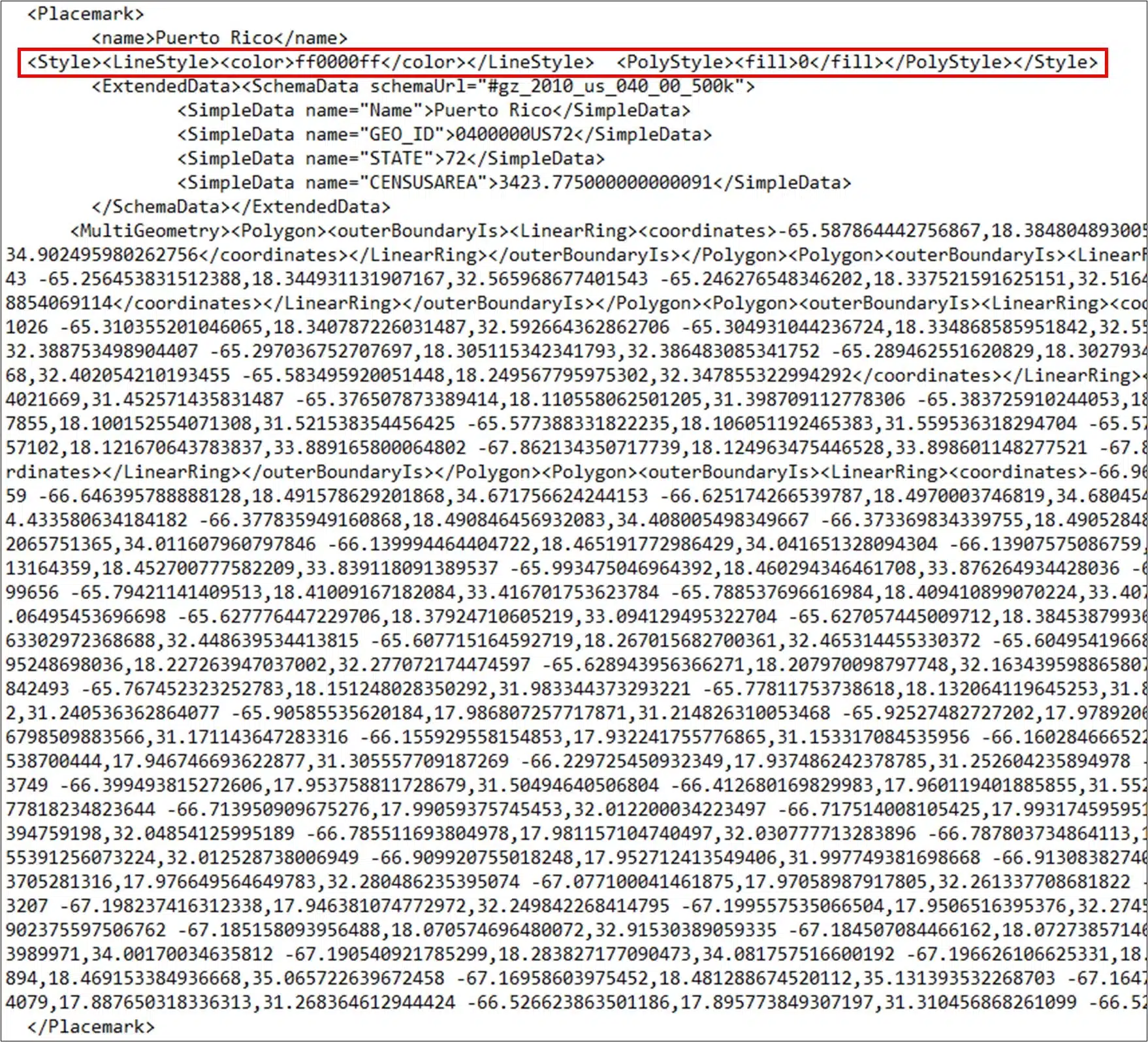
To create the shapes, I use the ‘st_polygon’ function from the sf package. Before doing this, it’s important to convert my long string of coordinates into a matrix with two columns for the latitude and the longitude. Other than that, it’s important to use the desired coordinate reference system (crs) and to convert your shape (polygon) into the datatype SpatialDataFrame.
############### Create a polygon for each state and primary key ###############

CreatePolygonFunction <- function(p_state_primary_key) {

  tryCatch(

    {

      ConvertPolygonCoordinatesToNumeric <- as.numeric(unlist(strsplit(as.character(p_state_primary_key$`Coordinates concatenation`), split = ",")))

      ConvertPolygonCoordinatesToMatrix <- matrix(ConvertPolygonCoordinatesToNumeric, ncol = 2, byrow = TRUE)


      CreatePolygon <- list(ConvertPolygonCoordinatesToMatrix)

      CreatePolygon <- st_polygon(CreatePolygon) %>% st_sfc(crs = 32611)

      SpatialPolygons <- as(CreatePolygon, 'Spatial')

      SpatialPolygons$State <- p_state_primary_key$State

      SpatialPolygons$Color <- p_state_primary_key$Color

      SpatialPolygons$`Max Color Threshold` <- p_state_primary_key$`Max Color Threshold`


      return(SpatialPolygons)

    },

    error = function(e) {

      stop(paste("Failed to draw a polygon on the map", e, "."))

    }

  )

}
The combination of custom visuals created in R and Power BI still needs improvement. Power BI typically uses the JavaScript/TypeScript SDKs. These are more reliable to implement and have a better performance for rendering your custom visuals. In the following question/answer on the Power BI community it is stated why that is so.
Whether R meshes well with Power BI really depends on how your R script is written. Are your functions complex? How many for loops do you use? Are you using the best practices? If your code already performs slow in R Studio when testing it, then it will surely be slow in Power BI.
Personally, I find that R is easier to comprehend, and R Studio is a great tool to debug your script. Regarding the performance, it’s a good thing that you make all your calculations beforehand in your data source or in Power BI and just use your R custom visual to create the VISUAL. If your script is not too complex, then it shouldn’t be a problem regarding the performance.

Crafted by ![]()
Crafted by ![]()


